Me AI
Me helps users understand their situation and tells them what to do next with clear reasoning and confidence

The Problem
The problem is never lack of information. It's knowing what to do.
Most financial and life planning tools assume the user's problem is a lack of data. They respond with more charts, more notifications, more numbers. But the actual struggle is different especially for young professionals with irregular income.
"Our problem is not lack of knowledge but not knowing what to do. It's a hurdle making decisions and making the right ones."
USER PAIN POINTS
Decision Paralysis
Too many options, Anxiety around making the 'wrong' choice No feedback on past decisions
Tool Failure
Data everywhere, clarity nowhere. Apps show what happened, not what to do.
Context Gap
Income irregularity makes planning feel pointless.
RESEARCH & INSIGHT
Who Was Me Designed For?
Research focused on three overlapping user types, all sharing a common trait: they're smart, informed people who still struggle to act with confidence on their own financial decisions.
Target Users
Structure that matches how ops teams think
Young Professionals, The Uncertain Freelancer, The Goal Setter Without a Plan. Age range: 18 – 35, Income status: Stable to variable, Pain: High awareness, low action
Research Questions

KEY INSIGHT
People don't want a financial advisor. They want to think out loud and get a response that feels like their own reasoning just faster and more complete. Me was born from this insight: an AI that mirrors your thinking, not replaces it.
PRODUCT CONCEPT
Me A Mirror of an Individual
The name and concept are intentional. Me is not a financial tool. It is a digital reflection of how you would reason through a decision if you had more time, more data, and less emotional noise.
"Just like thinking, but with faster results."
This framing shaped every design decision. The AI doesn't lecture. It doesn't show dashboards. It speaks like a thoughtful version of you identifying what matters right now, naming the trade offs, and giving you one clear action with a confidence level attached.
PRODUCT PRINCIPLES
Me is a calm, intelligent system that explains itself, a tool that adapts to your reality and respects your autonomy.
Me is not a passive data dashboard or black box recommendation engine, it’s not generic finance tracker or system that decides for you
INFORMATION ARCHITECTURE
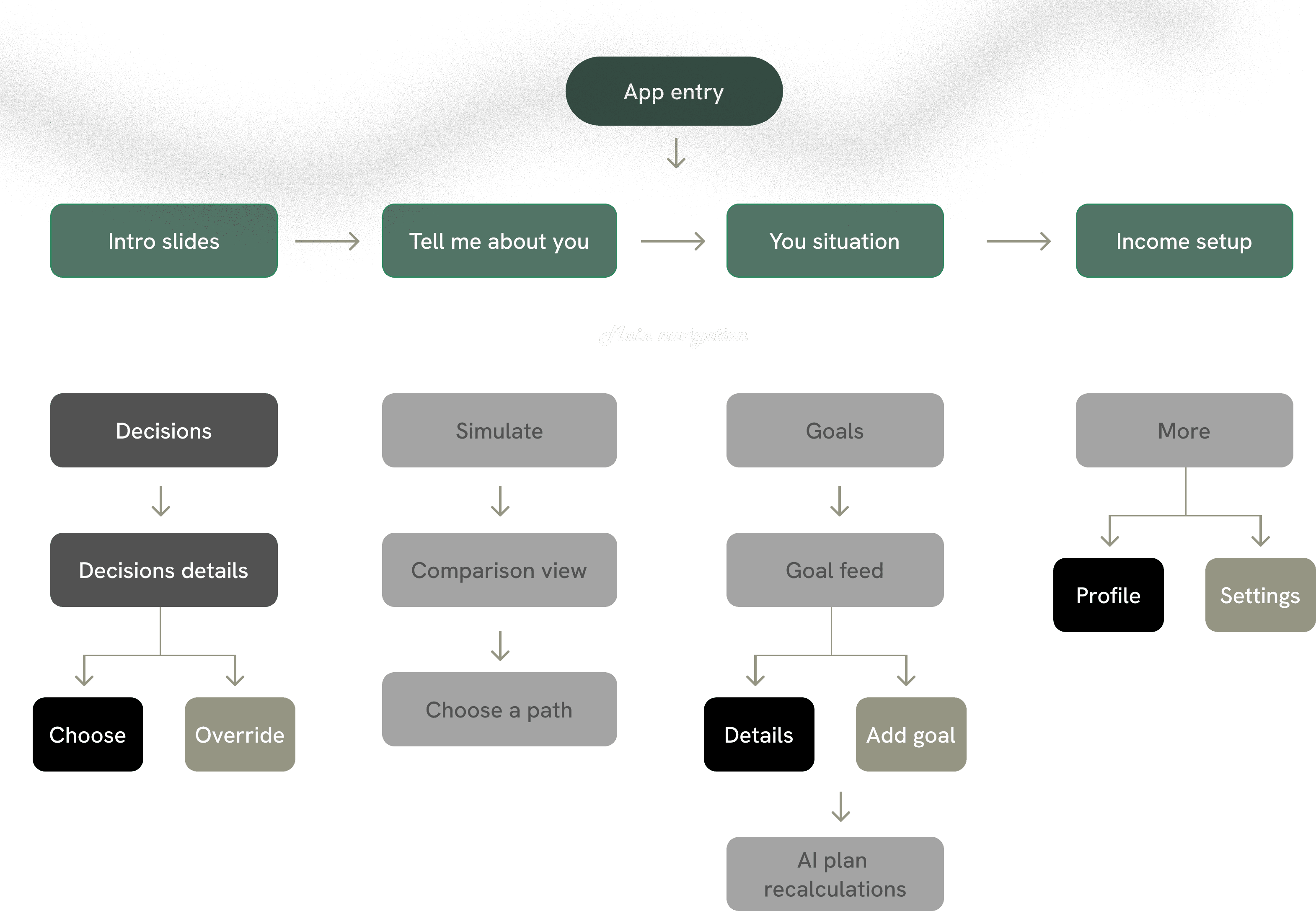
App Structure
Me is organized around four core areas. The navigation is deliberately minimal no buried settings, no overwhelming menus. Every screen serves one primary job.
USER FLOW
Colour and Typography
PRODUCT CONCEPT
Confidence Indicators
Confidence scores are not decorative. They it’s one of the core product feature that addresses one of the most common failures of AI products which is the black box.
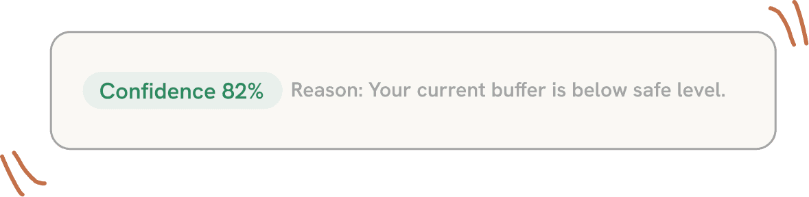
Most AI tools give recommendations without any signal of certainty. Users either over-trust them or dismiss them entirely. Confidence scores give users the information they need to make a calibrated decision to act confidently, delay, or override.
The UI
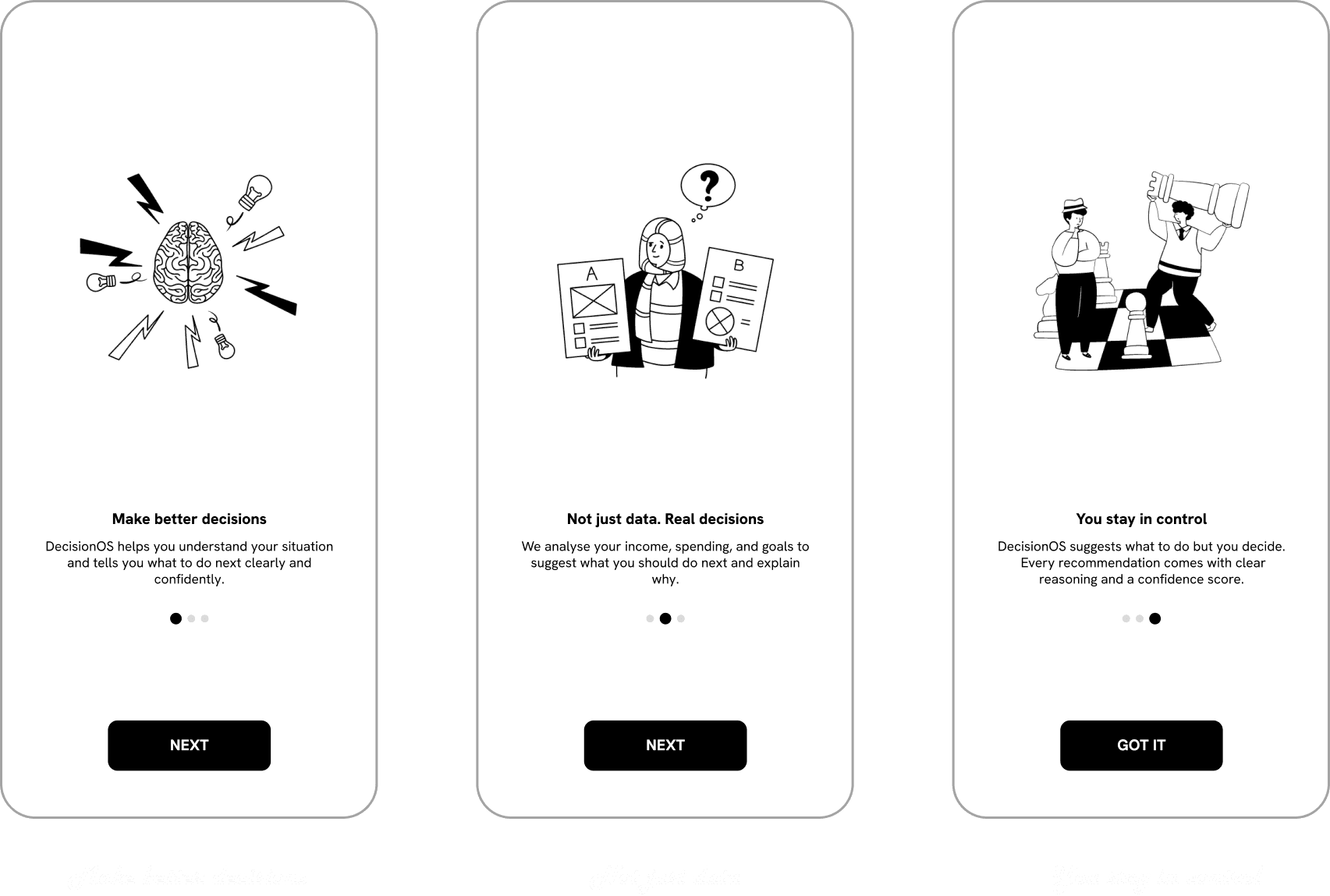
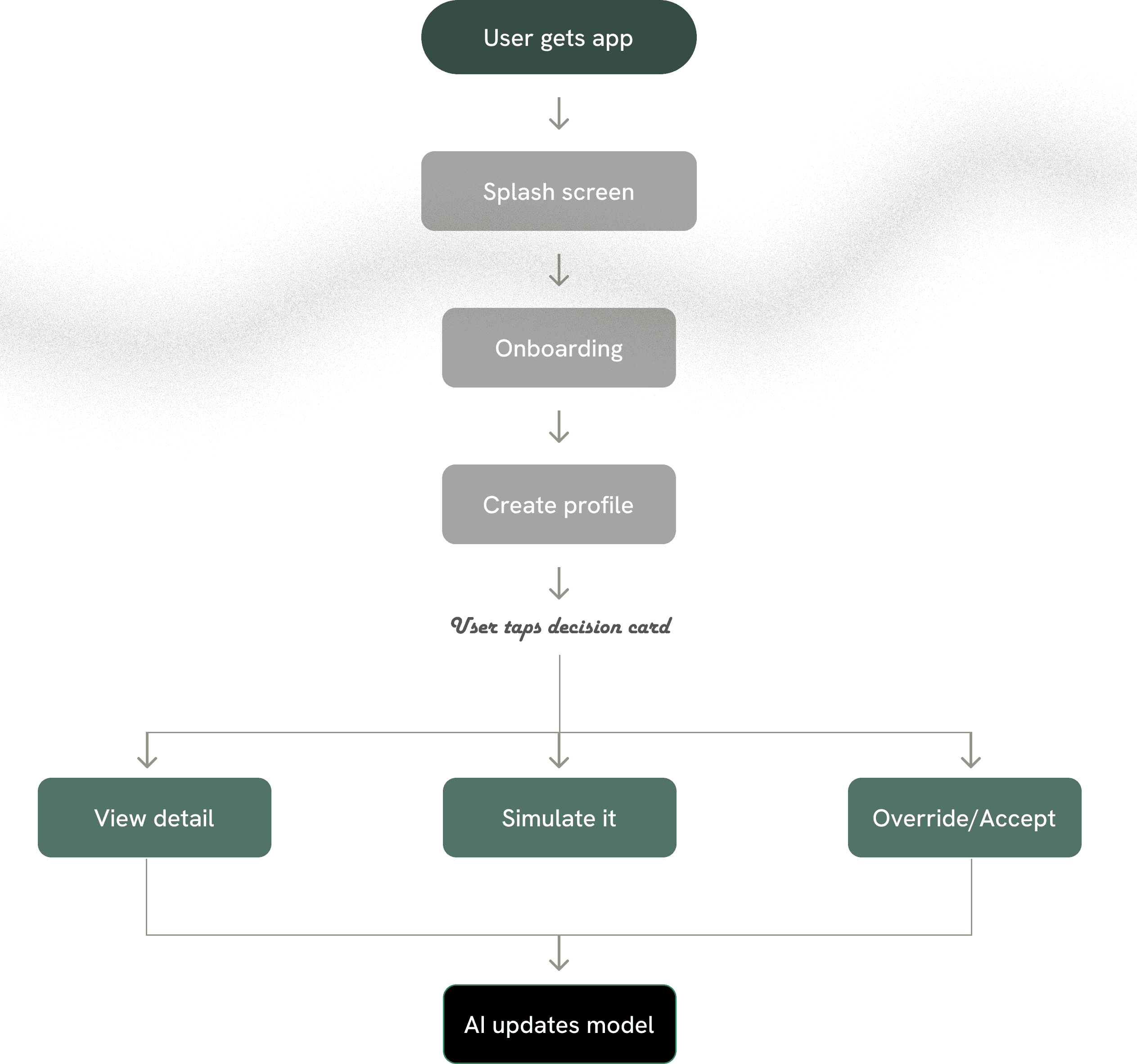
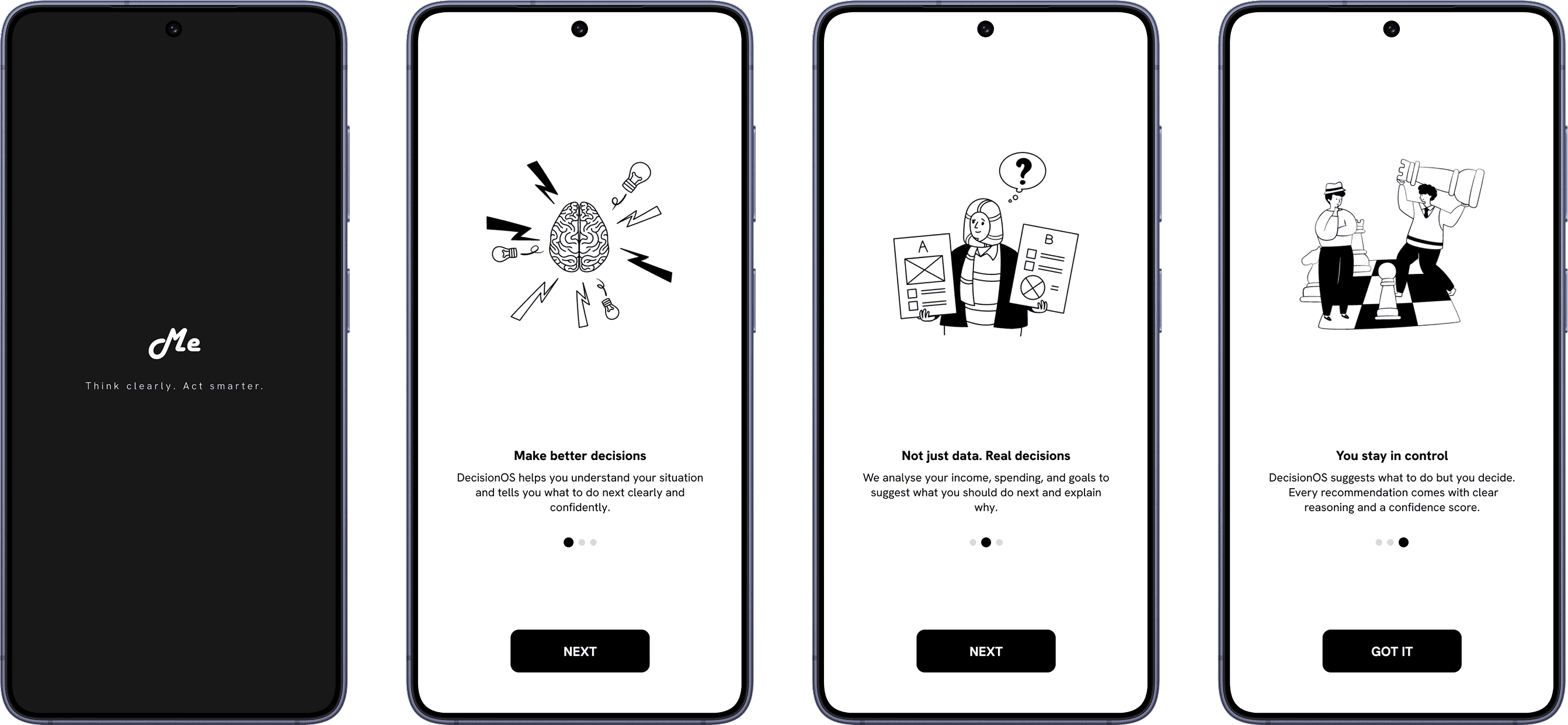
Onboarding
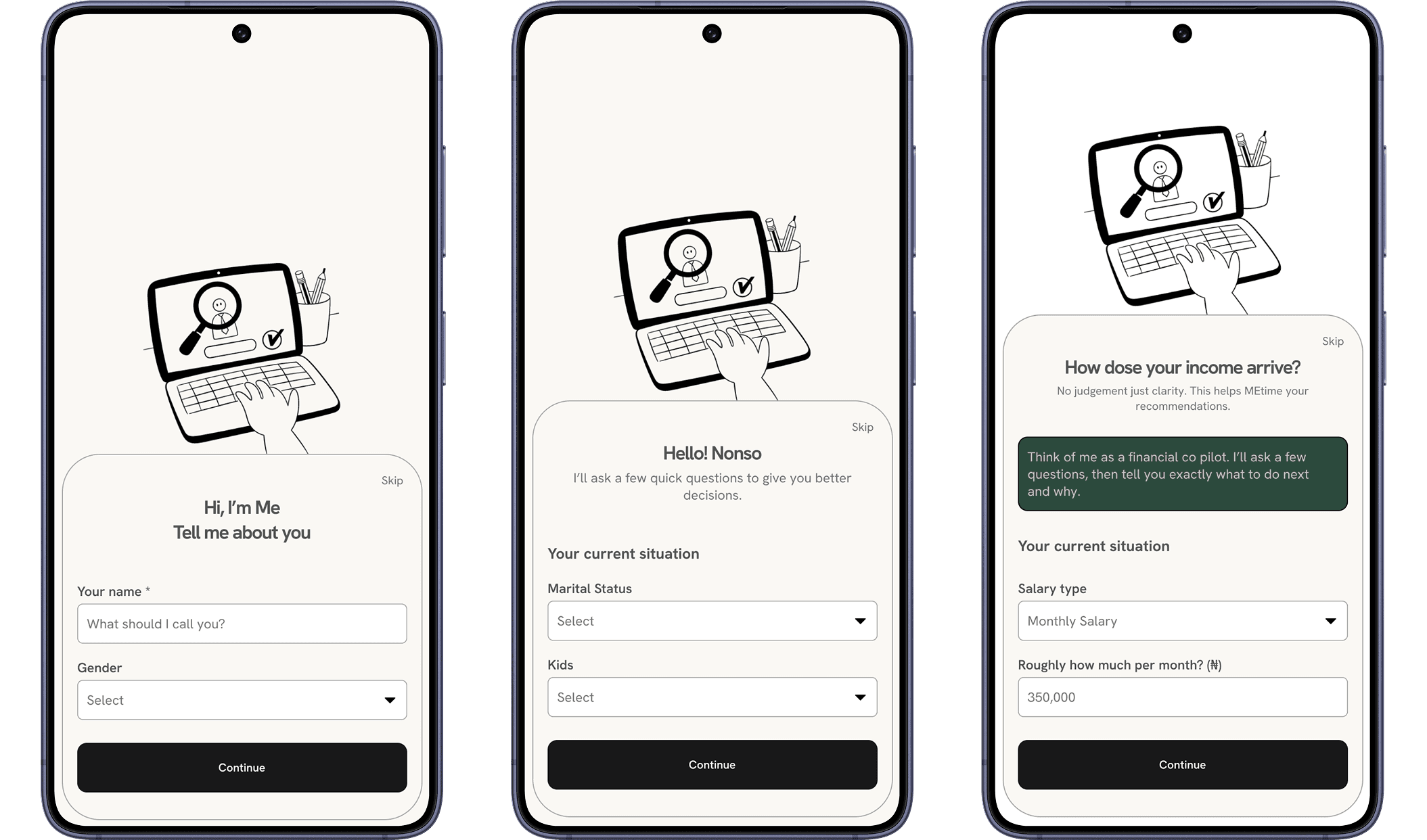
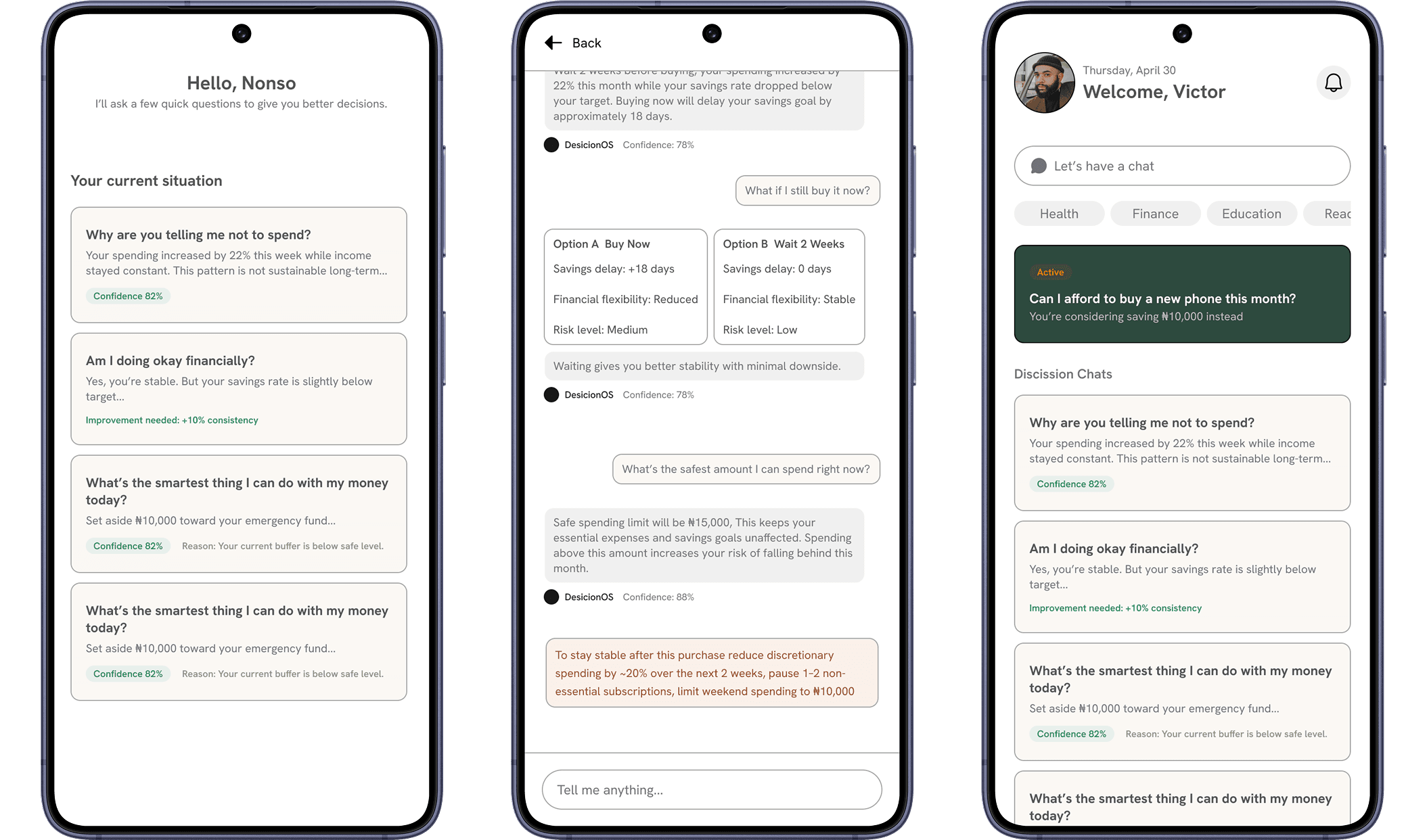
The onboarding was designed as a 3 step conversational flow, not a form. Each screen focused on clarity to the user. The opening message from the product immediately establishes the co pilot relationship.
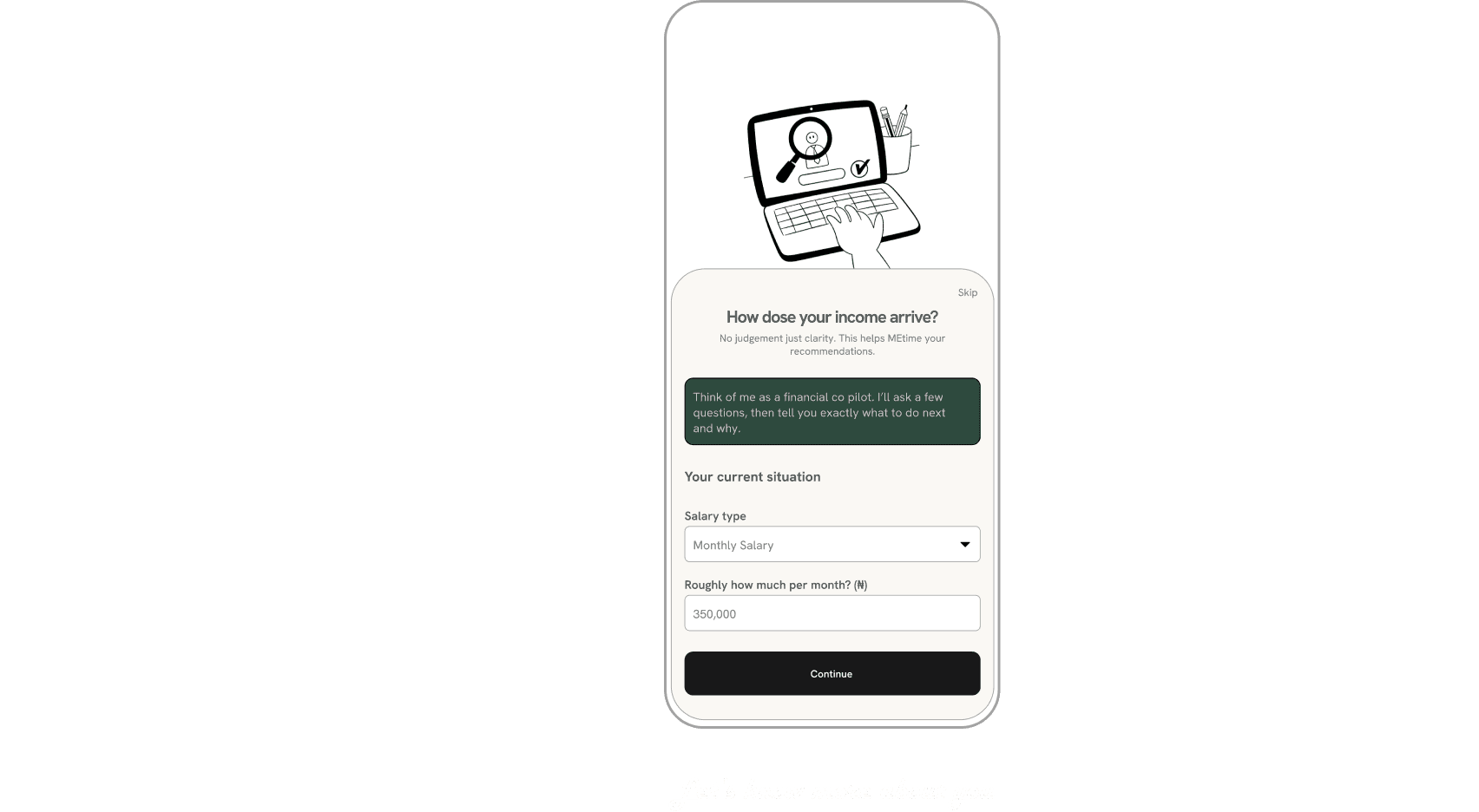
The platform tries to train it self in order to know you better
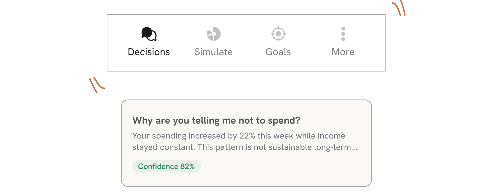
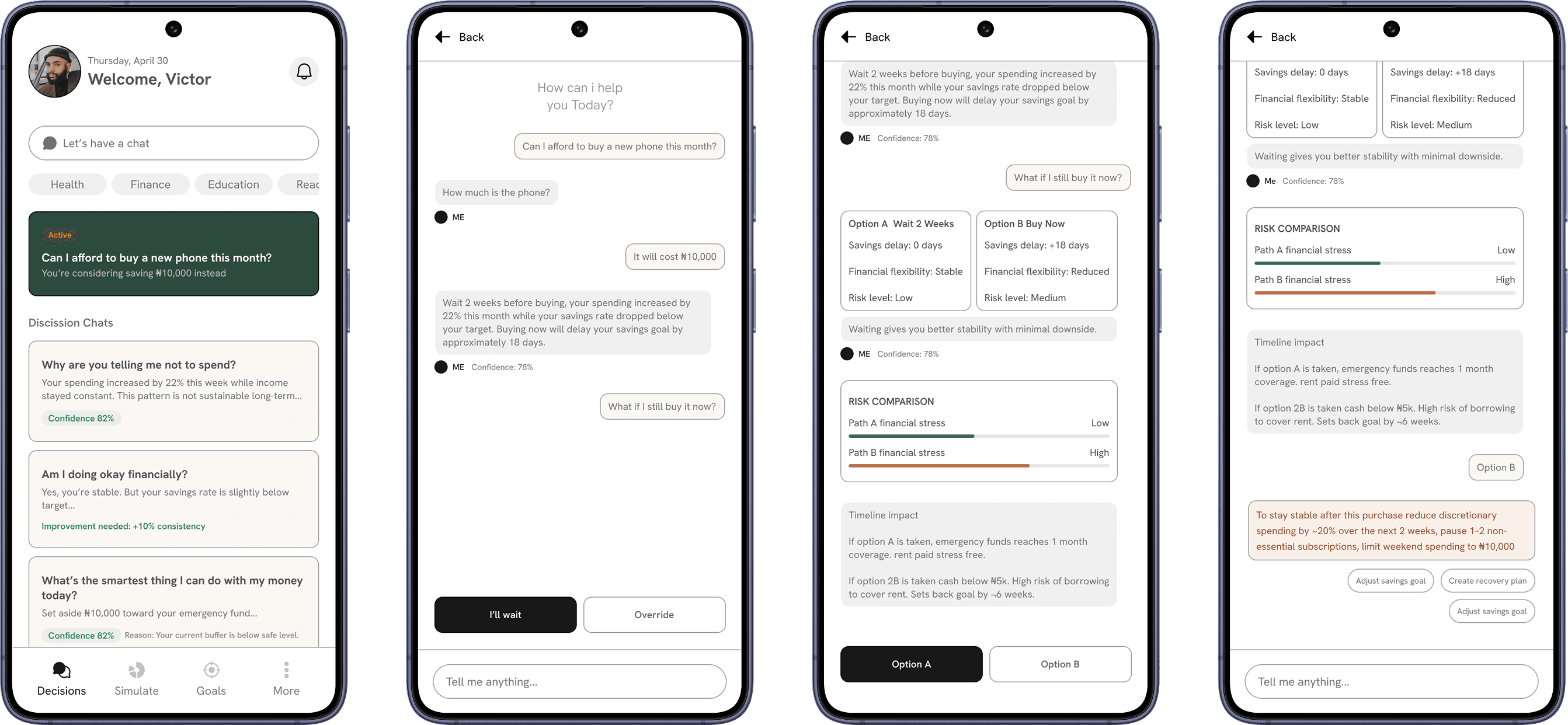
Decisions
The first thing users see is not their account balance. It is their Decision options/wants a summary of how many actions need attention today. This single framing shift changes the entire product experience: Me is about what to do next, not what happened last.
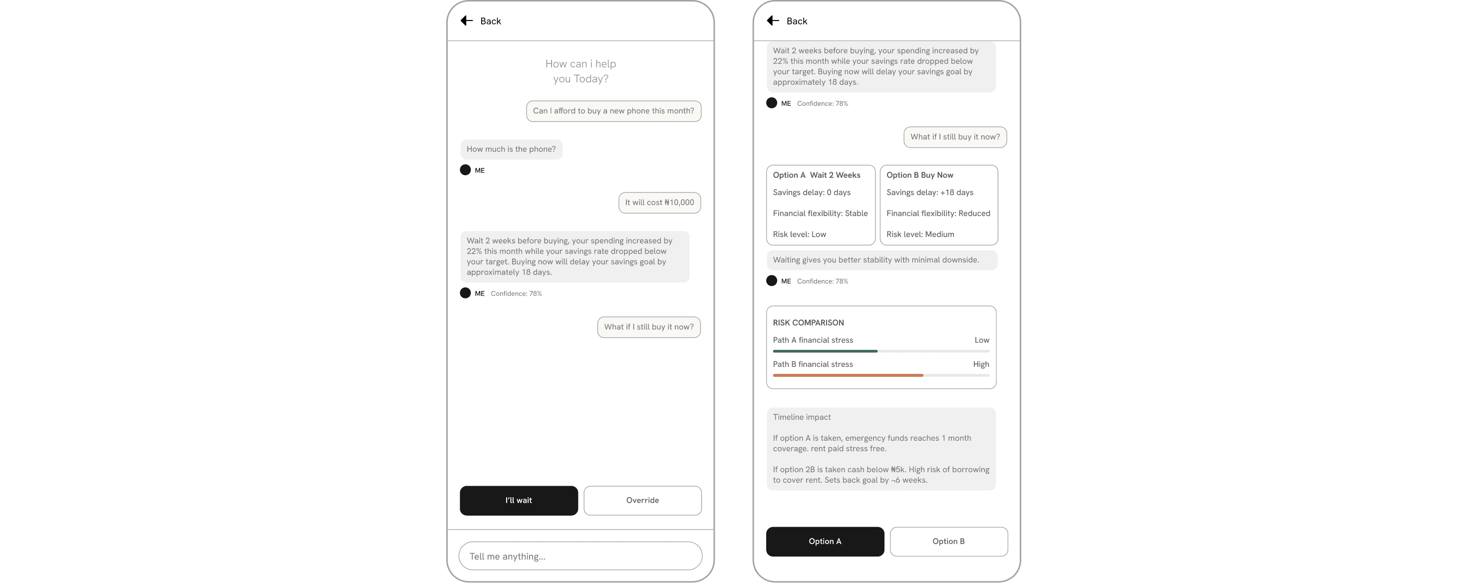
Decision Detail
Tapping any card opens the Detail screen. This screen has one job: show the user exactly how you ended up with certain choices and recommendation that was made. It includes the chat, data sources used, and crucially a dedicated section for what happens if the user ignores the recommendation.
The 'What if...' section is not an afterthought. It is a first class design element. Making consequences visible respects the user's intelligence and makes the AI feel honest rather than paternalistic.
Me most cognitively powerful screen. It lets users test decisions before making them. Rather than showing charts, it shows two named paths (Option A / Option B), key outcomes side by side, a visual risk comparison, and a timeline breakdown of what happens in each scenario.
I deliberately avoided graphs and percentages as primary elements. Instead, I choose to translate outcomes into plain language. Users can choose a path directly from this screen.

Goal Tracking
Goals in Me are not static targets. They are dynamic inputs that reshape the entire decision feed. When a user adds or modifies a goal, the AI immediately recalculates which actions to prioritise.
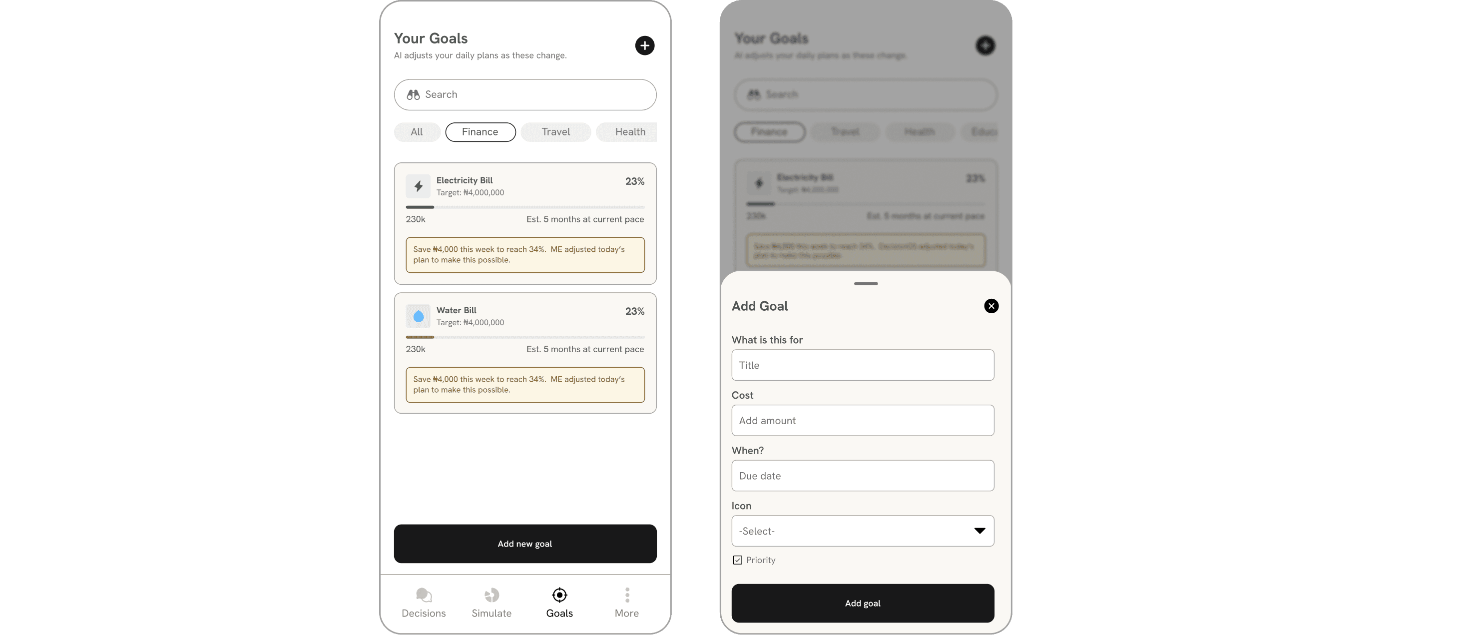
Each goal card shows current progress and estimated timeline. The connection between daily recommendations and long term goals is explicit never assumed.
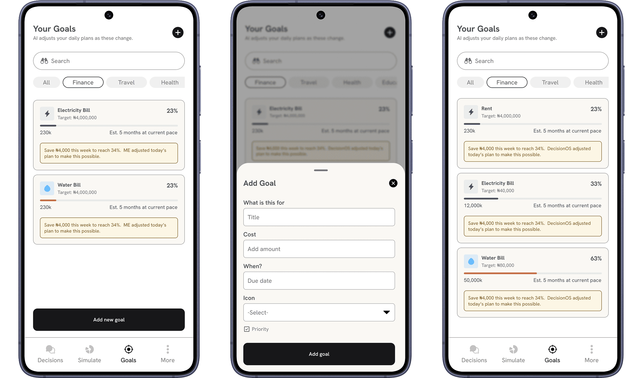
Me was designed with the explicit assumption that users' lives are not stable or predictable.
OUTCOMES & LEARNINGS
Me demonstrated that the most valuable thing an AI product can offer isn't more data it's a clearer path through the data that already exists.
Me is 'like talking to a smarter version of myself.' reduced resistance to AI recommendations significantly. The mirror metaphor works as a product concept.
“This product is just a design although i speak of it like a fully build and developed project”

Got an idea, startup, or product that needs thoughtful design? I’m always open to building products that solve real problems.